A curtain is the largest piece of fabric in most rooms, and its colour is the decision people make fastest and regret longest. We have been stitching curtains on Central Avenue since 1971, and the request we hear most often is not for a particular shade. It is to replace one that was chosen in a hurry.
Most colour advice you will find online was written for a different country. It assumes soft northern light, painted plaster, and a room that never sees forty-one degrees in May. Here is how curtain colour actually behaves in a Kolkata home.
Decide what the curtain is answering to
Every room has one surface that dominates it, and in a Kolkata flat that is almost always the wall. The floor comes second, the sofa third. Before you look at a single swatch, decide which of those the curtain is going to answer to, because a curtain cannot answer to all three.
A curtain tied to the wall makes a room feel larger and quieter. A curtain tied to the sofa makes the scheme look deliberate, but it draws the walls inward. If your sofa sits within a metre of the window, as it does in most flats here, tie the curtain to the wall. In a long drawing room where the seating floats away from the glass, you can let the curtain pick up the sofa or the rug instead.
The safest starting point is one or two steps deeper than the wall, in the same family. Not a different colour. The same colour, with more of it.
The direction your window faces matters more than the colour chart
South and west-facing windows in Kolkata take hard, direct sun for several hours a day from March through June. That light is not kind to dye.
Deep indigo, strong red, bright teal and black are the first to go, and they do not fade evenly. The leading edge of the panel, the part left exposed when the curtain is drawn back, takes the worst of it, so after two summers you are left with a pale vertical band down one side that no amount of cleaning will fix. Turning the panels end for end once a year slows it, but it does not stop it.
On those windows, choose mid-tones: stone, ecru, dull gold, muted olive, warm grey. Pigment-printed and yarn-dyed fabrics hold their colour considerably better than brightly surface-dyed ones, and a textured weave disguises what fading does occur. Save the deep, saturated colours for north and east-facing rooms, where they will still look the way you bought them in five years.
If the real problem is heat and glare rather than appearance, that is a lining and fabric-weight decision rather than a colour one, and blackout curtains solve it properly.
Your fabric will change colour on the way home
Showroom lighting is bright and close to neutral. Most Kolkata living rooms are lit in the evening by warm tube light or 3000K LED, and during the monsoon by flat grey daylight that has bounced off the building opposite. Fabric does not hold still across those conditions.
Cool greys and blue-greys go slightly green and lose their crispness under warm light. Warm beiges push further towards yellow. Lilac and dusty pink read almost grey. A colour that looked sophisticated across a counter can look muddy in your drawing room by eight in the evening, and nothing has gone wrong with the fabric.
So take a swatch home, and pin it to the wall rather than holding it in your hand. Look at it three times: late morning, at dusk, and at night with your own lights on. It costs nothing and it is the single most reliable way to avoid an expensive mistake. Every fabric we sell can go home with you first.
If your walls are cream or off-white
Which describes most flats in this city. Cream is forgiving, but it is not neutral, and that trips people up.
- For a quiet room: ecru, sand or oatmeal in a textured weave. Cotton and linen do this beautifully because the slub in the yarn gives the eye something to hold on to without introducing a second colour.
- For definition without drama: taupe, warm grey, muted olive or a dusty blue. These read as intentional rather than safe.
- For a statement: burgundy, bottle green or mustard, but only on a north or east window, and only if the floor is quiet. A patterned floor and a strong curtain will fight.
One thing to avoid: pure, cool white against a cream wall. It does not read as crisp, it reads as mismatched, and it makes the wall look grubby. Either match the white exactly or go warmer and commit to it.
Older Central and North Kolkata buildings often have dark timber doors and window frames. There the trick is to choose a curtain that sits between the wall and the woodwork in depth, so the dark wood stops looking like something left over from a previous decade and starts looking like part of the scheme.
The dust question nobody asks in the showroom
If your flat is on a lower floor of an arterial road, and Central Avenue is as good an example as any, the dust that settles on your curtains is a warm grey-beige. That is a colour, and it will sit on top of whatever colour you have chosen.
A mid-tone in a broken weave, a small all-over print or a subtle texture will look clean for months. Flat, dark, smooth fabrics are the opposite: navy, charcoal and black show road dust within days, and every fold reads as a shadow of grime. Pure white shows everything and greys along the bottom hem first, where it is hardest to ignore.
This is not a reason to avoid dark curtains. It is a reason to buy dark curtains with texture in them, and to be realistic about how often they will need cleaning.
Match the wall, or contrast with it?
Matching the wall makes the window dissolve into it. That is exactly what you want in a small bedroom, or on a window with a heavy grille, a window air-conditioner or a view of the neighbour’s wall. The room reads as one continuous surface and feels bigger than it measures.
Contrasting makes the window the feature of the room. Do it where the proportions are good, where there is a genuine view, or where the window is the only architectural event on that wall.
As for the sofa: do not match it exactly. Same family, different depth, or pick up a secondary colour from a printed cushion. Upholstery and curtains in an identical shade is the fastest way to make a living room look like a furniture display, and it also locks you in. Change the sofa fabric in six years and the curtains go too.
Two fabrics on one window
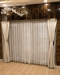
Layering a sheer behind a heavier curtain is the most useful thing you can do in this climate, because it gives you daytime privacy with the windows open and full cover at night. The colour rule is simple: the sheer should be lighter and no cooler than the main curtain. A bright white sheer behind a warm-toned drape is the commonest error we see; ivory does the same job without the clash.
On a long run of windows, alternating a printed panel with a plain one in the same palette works better than printing the whole wall. It gives the eye somewhere to rest, and it is far easier to live with.
One detail people miss: the heading changes how the colour reads. Deep pinch pleats throw permanent shadows into the folds, which makes any colour look a shade or two deeper and richer. Eyelets hang flatter and show you the fabric closer to its true colour. If you are choosing at the very edge of how dark you want to go, that difference matters.
Frequently Asked Questions
What colour curtains go with cream or off-white walls?
Ecru, sand, oatmeal, taupe, warm grey and muted olive all sit well against cream, and a textured weave will do more for the room than a stronger colour would. If you want something bolder, burgundy, bottle green and mustard work, but keep them to north or east-facing windows where they will not fade. The one combination to avoid is a cool, pure white curtain against a cream wall, which reads as mismatched rather than crisp.
Should curtains be lighter or darker than the walls?
Darker, in most cases. One or two steps deeper than the wall in the same colour family is the most reliable choice in an Indian home: it gives the window weight without introducing a second colour to manage. Lighter curtains work when the walls are already a strong colour, or when you specifically want the window to disappear into the wall.
Which curtain colours fade fastest in Kolkata?
Deep indigo and navy, strong reds, bright teals and black fade fastest, and they fade unevenly, so the exposed leading edge goes pale before the rest of the panel does. South and west-facing windows are where this happens. Mid-tones, stone, ecru and dull gold hold up far better, and yarn-dyed or pigment-printed fabrics outlast brightly surface-dyed ones.
Do dark curtains keep a room cooler?
Not on their own. A dark fabric absorbs more solar heat and then radiates a good part of it back into the room. What actually keeps a room cooler is a dense weave with a pale-backed lining, which is why proper blackout linings are usually light on the side facing the glass. Choose the colour for how it looks and the lining for how it performs.
What curtain colour makes a small room look bigger?
A shade close to the wall colour, hung from as near the ceiling as the structure allows and run wider than the window opening. The continuous surface is what creates the sense of space, far more than the particular colour. Heavy contrast at the window chops a small room into sections.
Should curtains match the sofa?
Relate to it, do not match it. Take the same colour family at a different depth, or pick up a secondary colour from the cushions. An exact match looks staged, and it means that whenever you change the sofa you are committed to changing the curtains too.
Can I use different curtain colours in different rooms?
Yes, and you should. Rooms that are seen from one another should share a palette rather than a colour, but a bedroom has no obligation to agree with the drawing room. What is worth keeping consistent through the flat is the heading style and the height the curtains are hung at, because that is what the eye registers as tidy.
See the colour in your own light before you commit
Colour is the one part of a curtain you cannot judge properly from a photograph or a phone screen. Come to the showroom with a picture of the room, the wall colour if you know it, and some idea of where the sun comes in. There are over 5,000 curtain fabrics here, a soft interior designer and an interior colour consultant in store, and you are welcome to take swatches home and live with them for a few days before deciding.
If you would rather start at the other end, our team offers free in-home measurement and can bring options to you. Either way, nothing gets cut until you are sure.
Avikar Furniture & Furnishings
46 Central Avenue, Bowbazar, Kolkata 700012
Monday to Saturday, 10:30 AM to 7:00 PM (Sunday closed). Parking available on request.
Call or WhatsApp 8080095551, or book a consultation.
Still working out the rest of the window? Start with our complete curtains buying guide, learn how to measure your windows, or browse the full curtain range.